Usability review: parkingfriend.com
#2 on the free review list comes from Geneva Switzerland, at parking-friend.com, a site for valet parking at the airport and other places.
Summary:
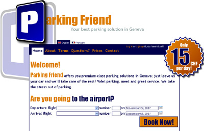
- Designed like a poster. The visual elements are strong and dominate the page. This would great for a poster where you need to draw attention, but if someone is on the web page you already have their attention. The large P element on the left and the price star on the right overpower the rest of the design. The P alone consumes 100+ pixels of width, purely for cosmetics. If the site were high style (shoes, clothes, etc.) maybe you could argue for the style value, but this is a parking site – a utility experience.
- Choices are hidden and links unclear. The page works by showing/hiding one of three choices: airport, event or other. Airport is chosen by default, but to see the option options you have to click on the right question. With only 3 choices there’s no reason to hide UI: radio buttons work very well for handling this kind of decision making.
- Colors and sizes are too strong . Trebuchet is known to be a good web design font, but if you split sentences into two colors and default to 20pt text, it gets hard to read (See the Terms page). Whitespace is increasingly important with difficult fonts or large sizes, but the text heavy pages on this site have few paragraph or line breaks. The purple/orange theme is good and works well, but it doesn’t need to be followed through within sentences – two color phrases are hard to read.
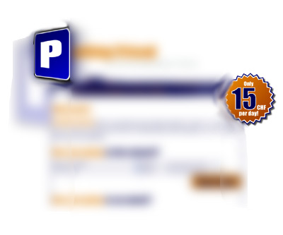
The squint test: One visual design trick is to squint your eyes and see how the page balances. The two dominant elements stand out like this (see below). The problem is that neither one earns it’s prominence, and they demand this first order attention on every single page.
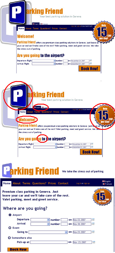
Simplified redesign:
Taking into account the above, this design simplifies the grid. The visual elements now fit the page, instead of demanding an unwarranted amount of pixels and attention. All text is one color, the hide/show UI is replaced by a simple radio button scheme. I also cleaned up the navbar, moving the language choices and log-in into a tighter layout.
Before and After:
A few things I missed:
- The price should be restated in the text, or before the book now button. Messages in graphics are often missed, as they’re offered parsed as secondary information, and the star on the right is the only place the fee is currently mentioned.
- Credibility should be emphasized. Why should people trust their cars to this company? The pitch for credibility should be stronger. There should be photos of the lot, of the service crew, statistics on how many satisfied customers there have been or how many years it’s been in operation, etc. on the front page (even if put behind a prominent “Why trust us” link).
- Radio button layout is dull. With more time I’d play with the text and radio button layout. Leading with a form is never sexy, but it gets straight to the primary task of this website: make a reservation. Looking at other parking websites shows similar form centric designs.
Thanks Scott! This is a great piece of advice. I will show it to my customers ASAP!
Hello Scott,
Thanks a lot for investing your time in this, helps us a lot to better understand our googleAnalytics rates ! I hope Adrian has some time left to apllie that ;o)
Again thank you !!!
Dieter, co-founder ParkigFriend
The original design looked kind of like a webpage embedded in a poster. Shrinking the logo real estate down drastically was a great step as were most of the other changes, but I still think the general “tone” of the page could be knocked down several notches. I know big is in, but you need to balance that look with a subtle palette and a tight layout.
Overall, great work – I love before and after write-ups.
Jason